The ferry Kitsap on the Mukilteo–Clinton run across Possession Sound, March 2023. Photo: Timothy A. Gonsalves, CC BY-SA 4.0, via Wikimedia Commons.
Class topic: MATH& 146, Section 1.1 — population and sample, parameter and statistic, and kinds of variables.
I first took a ferry here in 1996, when I moved to the Pacific Northwest. I still cross from Clinton to Mukilteo for work and back at least once a week. Some July mornings bring warm sun and barely a ripple; in winter the return can be wet, cold, and dark. I’ve watched the boats change and the docks rebuilt.
Then I read that the Mukilteo–Clinton ferry carried 402,261 riders in August, according to a South Whidbey Record report based on Washington State Ferries data. I wondered how many of those rides belonged to people like me, who make the same crossing week after week. My own commute puts me in the count at least twice a week. I am still one person.
The state’s winter survey reported 61% satisfaction on the Mukilteo–Clinton route, about six in ten. Across the ferry system, it reported 69%, about seven in ten. Those winter trips took place months before the August count. I wanted to know whose answers made up those percentages, and how much they could tell me about the people I share the ferry with.
A count of rides, a survey of people
The August figure counts boardings: each time someone gets on the ferry. When I go to work and come home, I add two boardings. The count tells us how many rides people took on this route in August. It cannot tell us how many different people took them.
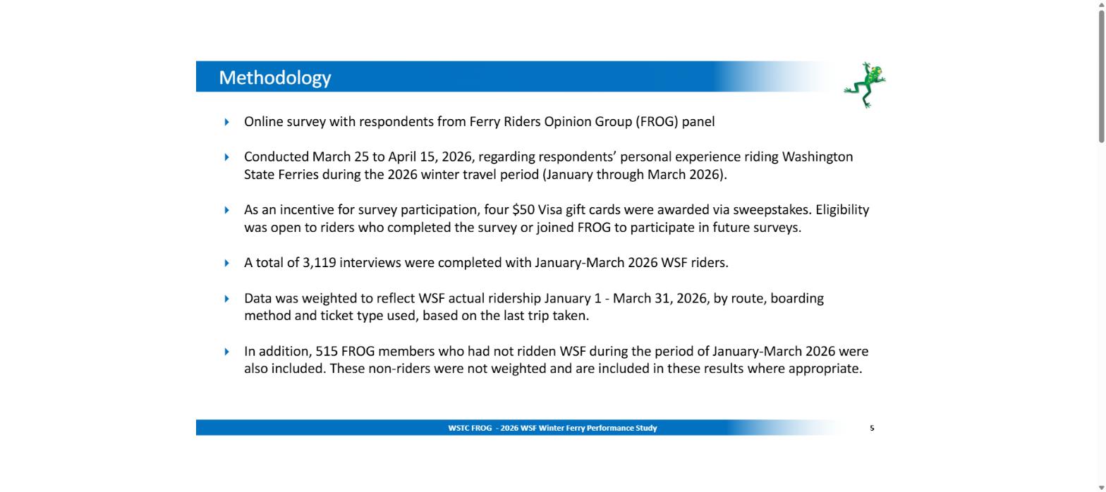
The satisfaction figures come from the Washington State Transportation Commission’s Ferry Riders Opinion Group, or FROG. Riders choose to join, then receive surveys online. 3,119 riders answered the 2026 winter survey across the ferry system. That is a lot of voices, but it is only some of the people who rode.
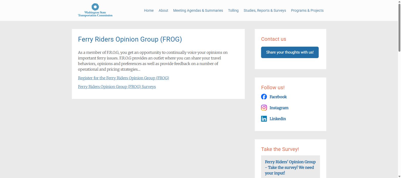
The FROG program page. Riders can register for the panel, a detail that matters when interpreting the survey.1
The report explains how the state handled the answers. It weighted them: it gave some replies more influence so the mix of routes, ways of boarding, and ticket types looked more like real ferry traffic. That helps with the mix. It cannot tell us what riders who never signed up would have said.
The report explains when the survey happened, how many people answered, and how the state adjusted the results to resemble real ferry traffic.2
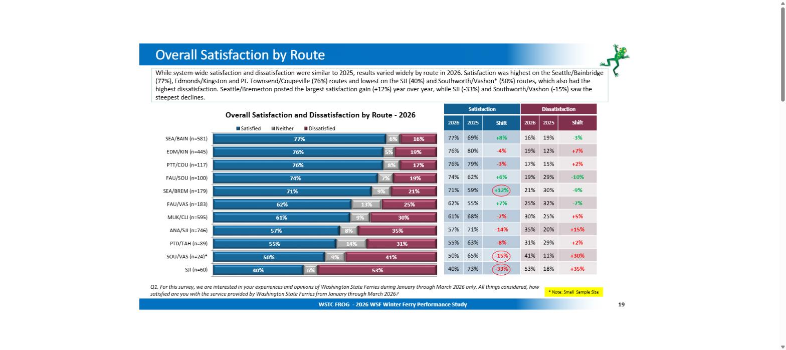
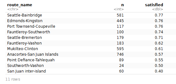
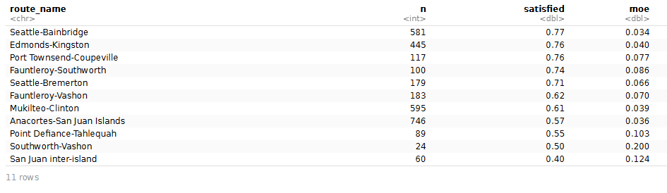
On page 19, I found my route: 595 people answered, and the report shows 61% satisfied. I copied the table into R to compare it with the other ten routes.
I put the route table into R, a program that helps me work with numbers. Each row is one ferry route. It shows how many people answered (the column called n) and what share said they were satisfied, neutral, or dissatisfied.
                   route_name   n satisfied
1          Seattle-Bainbridge 581      0.77
2            Edmonds-Kingston 445      0.76
3    Port Townsend-Coupeville 117      0.76
4       Fauntleroy-Southworth 100      0.74
5           Seattle-Bremerton 179      0.71
6           Fauntleroy-Vashon 183      0.62
7            Mukilteo-Clinton 595      0.61
8  Anacortes-San Juan Islands 746      0.57
9    Point Defiance-Tahlequah  89      0.55
10          Southworth-Vashon  24      0.50
11      San Juan inter-island  60      0.40
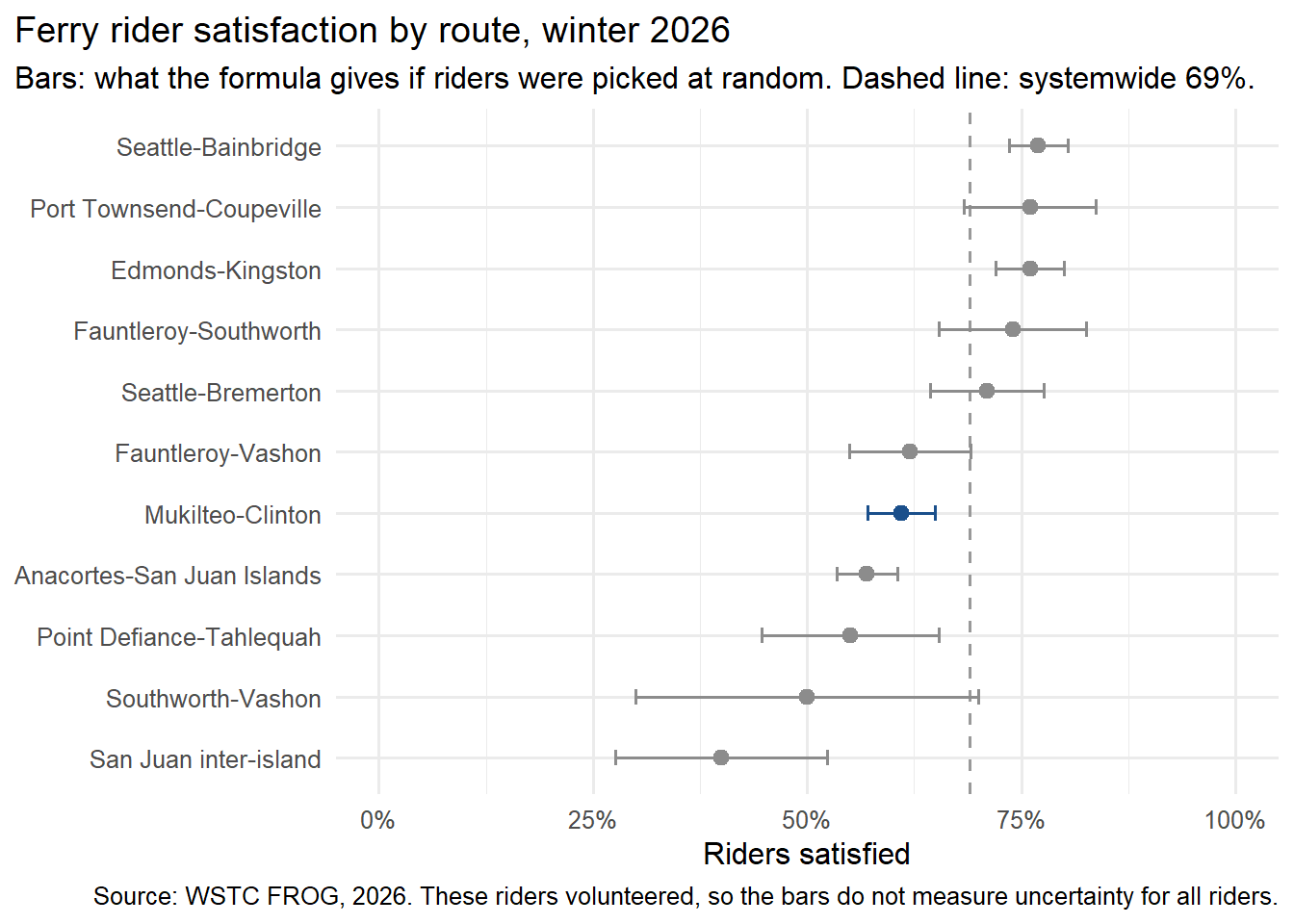
I used a margin-of-error formula to see what a random survey with these numbers might show. It takes the reported percentage and the number of people who answered. It gives a plus-or-minus amount: for 61% from 595 answers, the amount is about 4 percentage points, or 57% to 65%.
There is a catch. This formula assumes people were chosen at random, like names drawn from a hat. If you ran many such random surveys, about 95 out of 100 of the ranges would include the real percentage. That is the idea behind a 95% margin of error. FROG riders volunteered. The bars in my chart show how the number of answers changes the math. They do not measure how close this survey is to the opinions of all ferry riders.
The formula adds a plus-or-minus amount (the moe column) beside each route’s satisfaction percentage.
Show the code
# What the 95% margin-of-error formula gives if riders are picked at randomfrog$moe <-1.96*sqrt(frog$satisfied * (1- frog$satisfied) / frog$n)frog$low <- frog$satisfied - frog$moefrog$high <- frog$satisfied + frog$moefrog$moe <-round(frog$moe, 3)frog[, c("route_name", "n", "satisfied", "moe")]
library(ggplot2)frog$highlight <-ifelse(frog$route =="MUK/CLI", "Mukilteo-Clinton", "Other routes")ggplot(frog, aes(x = satisfied, y =reorder(route_name, satisfied), colour = highlight)) +geom_vline(xintercept =0.69, linetype ="dashed", colour ="grey60") +geom_errorbar(aes(xmin =pmax(low, 0), xmax =pmin(high, 1)), width =0.25, orientation ="y") +geom_point(size =2.5) +scale_colour_manual(values =c("Mukilteo-Clinton"="#1a4f8b", "Other routes"="grey55"),guide ="none") +scale_x_continuous(labels =function(x) paste0(round(x *100), "%"), limits =c(0, 1)) +labs(x ="Riders satisfied", y =NULL,title ="Ferry rider satisfaction by route, winter 2026",subtitle ="Bars: what the formula gives if riders were picked at random. Dashed line: systemwide 69%.",caption ="Source: WSTC FROG, 2026. These riders volunteered, so the bars do not measure uncertainty for all riders.") +theme_minimal(base_size =12) +theme(plot.title.position ="plot")
On my route, 595 people answered. The formula puts a line from about 57% to 65% around the reported 61%. The report showed 68% satisfaction on this route a year earlier. That change caught my eye, but the survey does not tell me what caused it.
Then I saw Southworth–Vashon: 50% satisfied, based on only 24 answers. The same formula draws a much longer line, from roughly 30% to 70%. In a group that small, each answer has a lot of influence. That 50% needs more care than the chart’s neat dot suggests. The report itself marks it as a small sample.
Across the system, 3,119 people answered. With that many answers, the formula draws a shorter line around 69%: about 67% to 71%. Asking more people can steady a percentage. It still cannot tell us what people who never joined the panel would have said.
The class words for what I found
My commute makes the difference between a boarding and a person plain. In a four-week stretch, my trips to Mukilteo and back add at least eight boardings to the tally. All eight are mine. In the survey, one person gives one answer. The 402,261 August boardings do not mean 402,261 different people.
This helped me understand four words from class:
A population is the whole group I want to describe. For the August count, that is every recorded boarding on this route that month. For the winter survey, it would be all the riders whose winter experiences I want to understand.
A sample is the smaller group I actually ask. Here, that is the 3,119 survey respondents across the ferry system. Only 595 of them answered about my route.
A parameter is a number for the whole group. The 402,261 boardings are the count for the full set of recorded August boardings.
A statistic is a number worked out from the smaller group. The survey’s 69% satisfaction across the system and 61% on my route are statistics.
The terms are less intimidating when I ask one plain question first: Did the number come from everyone in the group I care about, or from only some of them?
August ridership count
Winter satisfaction survey
What goes into it?
Every recorded boarding on Mukilteo–Clinton in August
Answers from 3,119 riders across the system
Whole group or smaller group?
The whole group of recorded August boardings: population
A smaller group of riders: sample
What number comes out?
402,261 boardings: parameter
69% satisfied systemwide: statistic
A variable is just one thing I can write down about each ride or rider. I might record the route, the departure time, the delay, or someone’s satisfaction. Some variables are labels (called qualitative); others are numbers I can count or measure (called quantitative). A discrete number is a count in whole steps, like boardings. A continuous number is a measurement that can include fractions, like minutes late. The class gives these variables more specific names, too:
What I write down
Label or number?
What kind, and why?
Route name
Label (qualitative)
Nominal: the names have no ranking.
Satisfaction from 1 to 5
Ordered label (qualitative)
Ordinal: 5 is higher than 4, but nothing says the gap from 4 to 5 equals the gap from 1 to 2.
Scheduled departure time
Number (quantitative)
Interval: clock times have equal gaps, but there’s no true zero, so 10 AM is not twice 5 AM.
Boardings in a month
Count (quantitative, discrete)
Ratio: zero means none, so 400,000 is twice 200,000.
Minutes late
Measured amount (quantitative, continuous)
Ratio: zero means no delay, so 10 minutes is twice 5.
The Mukilteo terminal from a departing ferry. Photo: SounderBruce, CC BY-SA 4.0, via Wikimedia Commons.
What I will remember on the next crossing
Over the years, my experience of the Clinton run has been varied. From the deck, it looks to me like the boats have gotten bigger while the schedule has stayed about the same. In summer, the route sometimes runs an older, smaller boat alongside a newer, larger one. The small one seems quicker to load and unload. I’ve watched it leave on time while the big boat sat at the dock another five to seven minutes. I don’t know how the schedule is set, but those minutes add up.
I walk on, so those minutes matter most at the bus stop. The buses on both sides leave on schedule; they don’t wait for the boat. I’ve come off the ferry three to seven minutes late and watched the bus pull away, then waited 45 minutes for the next one, especially in the evening. Now, if I’m at the dock early, I’ll take the bigger boat, because it’s usually running late anyway. None of that shows up in a single satisfaction number.
That is what I want to look at next. About four in five riders who answered the winter survey had driven on for their most recent trip, so walk-on riders like me were only about one answer in five.4 I couldn’t find satisfaction broken out by how people board, or by whether they commute or visit. I’d like to see walk-ons compared with drivers, and daily commuters compared with occasional visitors. My dad made this crossing every day for work, and it can wear on you. A route-wide 61% can blur those groups together. Splitting it would help, but each group would be a smaller slice of the 595 answers, so its margin of error would be wider. That’s the same lesson as Southworth–Vashon’s 24 answers, showing up on my own route.
Cars queue at the Mukilteo toll booths, September 2025. Photo: SounderBruce, CC BY-SA 4.0, via Wikimedia Commons.