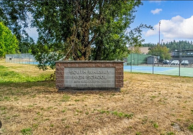
The South Whidbey High School sign on Maxwelton Road in Langley, 2011. Photo: Davin Fladager-McCullough.
Class topic: MATH& 146, Sections 1.3 and 1.4 — the frame, simple random sampling, and systematic, stratified and cluster sampling.
From first through eighth grade I went to Whidbey Island Waldorf School, a private school. For high school I switched to South Whidbey High School, the public high school on the south end of the island. I graduated in 2011.
That switch gave me a question. Suppose Washington wanted to estimate what share of its public school students are low-income, but could visit only 50 schools. Would South Whidbey High be among them? And how much would the answer depend on the way the state picked?
Across the water in Mukilteo, Kamiak High School enrolled 2,284 students in 2025–26. South Whidbey High enrolled 405. A survey that picks schools has to account for a difference like that: each school gets a place on the list, but each school does not hold the same number of students.
Where the numbers come from
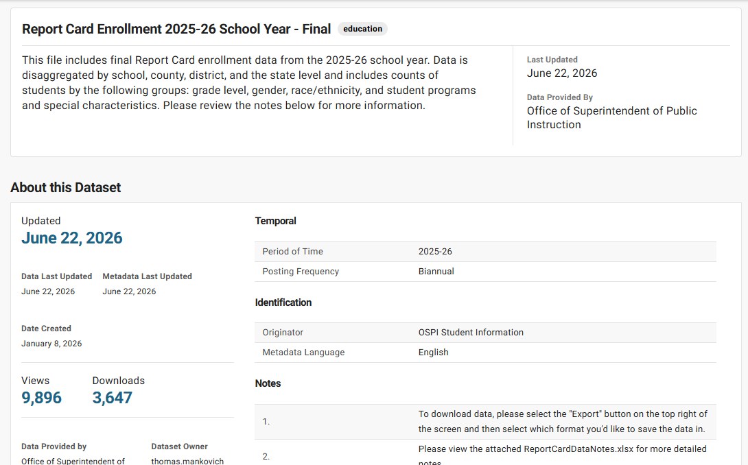
Every fall, Washington’s Office of Superintendent of Public Instruction (OSPI) counts the students in every public school on the first business day of October. It publishes the counts on the state’s open-data site.1 One of the counts is low-income students. In Washington that means students who qualify for free or reduced-price school meals.2 Statewide, it’s close to half of all students.
The state’s school enrollment list for 2025-26. It has one row for every public school, with how many students it has and how many are low-income.
In class, the list we draw from is called a frame. Here it begins with Washington’s public schools. My Waldorf school is private, so it never appears. However carefully I sample this list, I cannot pick a school that is missing from it. Later, I narrow the list again to schools with the information this analysis needs.
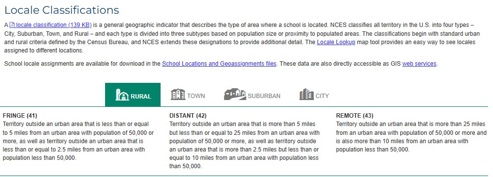
I also wanted to compare schools by place. The National Center for Education Statistics sorts them into City, Suburb, Town, and Rural groups.3 South Whidbey High is Rural: Fringe; Kamiak is Suburb: Large. “Fringe” means South Whidbey High is in a rural area close to an urban area or town, according to the federal distance rules.
How the federal government decides a school is rural. South Whidbey High falls in the first box, “Fringe (41).”
What I did in R
A short script, prepare-data.R, downloads both lists straight from the source, so anyone can rerun it. Then I loaded them into R.
The state’s list in R: one row per school, with its county, district, number of students and number of low-income students.
Show the code
schools <-read.csv("ospi_enrollment_2025-26_schools.csv",colClasses =c(districtcode ="character", schoolcode ="character"))locale <-read.csv("nces_locale_2024-25_wa.csv", colClasses =c(seasch ="character"))nrow(schools) # every public school on the state's listhead(schools[, c("county", "districtname", "schoolname", "all_students", "low_income")])
I matched the state’s schools to their federal place labels. The state list had 2,413 schools; 2,343 had everything I needed for this comparison. I left out 19 without a matching federal label, 46 with no students counted, and 5 whose low-income counts were hidden for privacy.
Among the students in those 2,343 schools, 47.4% were counted as low-income. That is the answer for my final list. In class, an answer for the whole group is called a parameter. Each sample below tries to estimate it. It is not a figure for every public or private school student in Washington.
Show the code
# Give each school the federal city / suburb / town / rural labelschools$seasch <-paste(schools$districtcode, schools$schoolcode, sep ="-")locale$area <-ifelse(locale$urban_centric_locale >=11,c("City", "Suburb", "Town", "Rural")[pmax(1, locale$urban_centric_locale %/%10)], NA)frame <-merge(schools, locale[, c("seasch", "area")], by ="seasch") # schools with no label drop out# Keep schools that have students and a visible low-income countframe <-subset(frame, all_students >0& low_income + non_low_income == all_students)frame <- frame[order(frame$districtcode, frame$schoolcode), ] # the order OSPI lists themN <-nrow(frame)N# The true answer for the whole list (the parameter)true_pct <-100*sum(frame$low_income) /sum(frame$all_students)round(true_pct, 1)
Then I split the list by area. This table surprised me.
Show the code
by_area <-aggregate(cbind(all_students, low_income) ~ area, data = frame, FUN = sum)by_area$schools <-as.vector(table(frame$area)[by_area$area])by_area$pct_low_income <-round(100* by_area$low_income / by_area$all_students, 1)by_area[, c("area", "schools", "all_students", "pct_low_income")]subset(frame, schoolname %in%c("South Whidbey High School", "Kamiak High School"),c(schoolname, area, all_students, low_income))
Area
Schools
Students
Low-income
City
752
379,548
50.3%
Suburb
762
439,497
41.8%
Town
313
132,138
54.8%
Rural
516
144,818
49.9%
Rural schools make up 22% of the schools in my list but enroll 13% of its students. There are many rural schools, but they tend to be smaller. In this list, suburban schools have the lowest low-income share and town schools the highest.
South Whidbey High and Kamiak looked more alike than I expected: 145 of 405 students (36%) at South Whidbey High and 767 of 2,284 (34%) at Kamiak were counted as low-income. Both are below the 47.4% for my final list. I had expected the rural school to have the higher share. These two schools overturned that expectation, though they cannot tell me what every rural or suburban school is like.
Four ways to pick 50 schools
Say the state can only visit 50 schools. Here are the four ways from class to pick them. I set a seed first (set.seed(146), after the class number). A seed makes R’s random picks repeatable: anyone who runs my code gets the same 50 schools I did.
Simple random sample (SRS): every school’s name goes in a hat, and I draw 50. Every group of 50 schools is equally likely.
Systematic sample: divide the list size by 50 to get a step size: 2,343 ÷ 50 = 46.9, rounded down to k = 46, as the textbook does. Pick a random starting school between 1 and 46, then take every 46th school down the list. Before this draw, I sort the list by district code. Rounding down has one catch: the last 43 schools on the list can never be picked. That’s under 2% of the list, so it barely moves the results. A bigger study would use a method that covers every school.
Stratified sample: split the list into groups first (City, Suburb, Town, Rural), then draw a random sample from each group. Each group gets a share of the 50 that matches its share of schools: 16 city, 16 suburban, 7 town and 11 rural.
Cluster sample: pick whole districts at random and take every school in them. I picked 7 districts, which comes to about 50 schools on average.
The one-line test I’ll remember: stratified = some schools from every group; cluster = every school from some groups.
One draw of each method: how many schools it picked, how many were rural, and its guess at the low-income share.
Show the code
set.seed(146) # the class number, so anyone who reruns this gets the same schoolsn <-50# schools per sample# The estimate: out of all students in the picked schools, what % are low-income?pct <-function(s) 100*sum(s$low_income) /sum(s$all_students)# 1. Simple random sample: 50 names from a hatdraw_srs <-function() frame[sample(N, n), ]# 2. Systematic (textbook method): k = list size / 50, rounded down;# random start from 1 to k, then every kth schooldraw_systematic <-function(data = frame) { k <-nrow(data) %/% n # 2,343 / 50 = 46.86, rounded down to 46 start <-sample(k, 1) data[seq(start, by = k, length.out = n), ]}# 3. Stratified: a random sample from each area, sized to match its share of schoolssizes <-round(n *table(frame$area) / N)draw_stratified <-function() {do.call(rbind, lapply(names(sizes), function(a) { rows <-which(frame$area == a) frame[rows[sample(length(rows), sizes[[a]])], ] }))}# 4. Cluster: 7 whole districts at random, every school in themdistricts <-unique(frame$districtcode)draw_cluster <-function() frame[frame$districtcode %in%sample(districts, 7), ]one <-list(SRS =draw_srs(), Systematic =draw_systematic(),Stratified =draw_stratified(), Cluster =draw_cluster())data.frame(schools =sapply(one, nrow),rural_schools =sapply(one, function(s) sum(s$area =="Rural")),pct_low_income =round(sapply(one, pct), 1))
Method
Schools picked
Rural schools
Low-income guess
Simple random
50
8
51.3%
Systematic
50
11
51.7%
Stratified
50
11
46.1%
Cluster
46
6
60.4%
The answer for my full list is 47.4%. In this one set of draws, the stratified sample came closest. The cluster sample was 13 percentage points high. One draw can favor a method by luck, so I repeated the draws before comparing them.
None of these four draws picked South Whidbey High. In a simple random draw of 50 from 2,343 schools, its chance of appearing is about 2%, or 1 in 47. That is the answer to my opening question for one draw from this list.
One sample can get lucky, so I drew 1,000
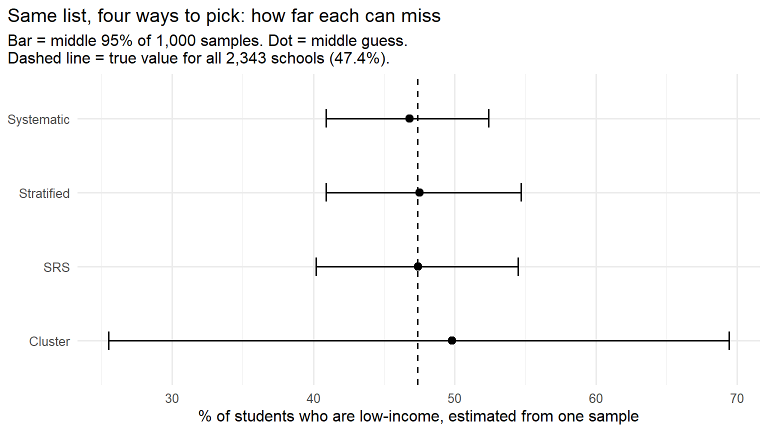
One draw can land close by luck. To see how much the answers moved, I had R repeat each method 1,000 times. For each method, the chart shows the middle 95% of the resulting estimates. A shorter bar means the guesses varied less in these runs.
Show the code
reps <-1000sims <-data.frame(method =rep(c("SRS", "Systematic", "Stratified", "Cluster"), each = reps),estimate =c(replicate(reps, pct(draw_srs())),replicate(reps, pct(draw_systematic())),replicate(reps, pct(draw_stratified())),replicate(reps, pct(draw_cluster()))))# Middle 95% of the 1,000 estimates for each methodspread <-do.call(rbind, lapply(split(sims$estimate, sims$method), function(x)data.frame(low =unname(quantile(x, 0.025)), mid =median(x), high =unname(quantile(x, 0.975)))))spread$method <-rownames(spread)rownames(spread) <-NULLspread[, c("low", "mid", "high")] <-round(spread[, c("low", "mid", "high")], 1)spread$width <- spread$high - spread$lowspread[order(spread$width), c("method", "low", "mid", "high", "width")]# Average guess for each method, and how much a cluster sample's size swingsround(tapply(sims$estimate, sims$method, mean), 1)cluster_sizes <-replicate(reps, nrow(draw_cluster()))range(cluster_sizes)
Show the code
library(ggplot2)spread$method <-factor(spread$method, levels = spread$method[order(spread$width, decreasing =TRUE)])ggplot(spread, aes(y = method)) +geom_errorbar(aes(xmin = low, xmax = high), orientation ="y", width =0.25) +geom_point(aes(x = mid), size =2.5) +geom_vline(xintercept = true_pct, linetype ="dashed") +labs(x ="% of students who are low-income, estimated from one sample",y =NULL,title ="Same list, four ways to pick: how far each can miss",subtitle =paste0("Bar = middle 95% of 1,000 samples. Dot = middle guess.\nDashed line = true value for all ",format(N, big.mark =","), " schools (", round(true_pct, 1), "%).")) +theme_minimal(base_size =12) +theme(plot.title.position ="plot")
Method
Middle 95% of guesses
Width
Systematic
40.9% to 52.4%
11.5 points
Stratified
40.9% to 54.7%
13.8 points
Simple random
40.2% to 54.5%
14.3 points
Cluster
25.5% to 69.4%
43.9 points
Cluster sampling produced the widest spread of estimates here. A wide spread does not mean every cluster draw missed; it means the guesses varied the most. Schools in the same district often serve similar neighborhoods, so 7 districts can give fewer different views than 50 separate schools. The size of a cluster sample also swung, from 9 to 222 schools across the 1,000 draws. Its average estimate was 49.0%, about 1.6 points above the 47.4% for my list.
Stratified sampling narrowed the spread a little (13.8 points, against 14.3 for simple random sampling). It makes sure every kind of place shows up. But in this list the four areas’ low-income shares are not far apart, 42% to 55%, so guaranteeing each area a share changes less than it would if the groups differed more.
Systematic sampling had the narrowest spread here (40.9% to 52.4%, 11.5 points). I sorted schools by district code before sampling. That order may help spread the picks across districts. When I shuffled the list, the systematic estimates spread out more, to 41.2% to 55.1% (13.9 points). The comparison suggests that list order matters here; it does not prove that district grouping is the only reason.
Show the code
# Test: does systematic still win if the list is shuffled first?shuffled <- frame[sample(N), ]shuffled_sys <-replicate(reps, pct(draw_systematic(shuffled)))round(quantile(shuffled_sys, c(0.025, 0.975)), 1)
How confident can we be? These bars show what happened when I repeatedly sampled from the same 2,343-school list. They describe the luck of the draw within that list. They do not measure the effect of leaving schools out, using an imperfect low-income measure, or changing the list in another school year.
The class words for what I found
Class word
In plain words
In this post
Frame
The list you pick from
OSPI’s list of public schools. My private Waldorf school isn’t on it
Parameter
The number for everyone in the group being studied
47.4% among students at the 2,343 schools in my final list
Statistic
A number calculated from one sample
Each draw’s estimated low-income share
Simple random
Names from a hat
50 schools, any 50 equally likely
Systematic
Every kth on the list, random start
Every 46th school (2,343 ÷ 50, rounded down)
Stratified
Some from every group
A share from City, Suburb, Town and Rural
Cluster
Every one from some groups
All schools in 7 random districts
Every method here begins with a random choice. A convenience sample would be different: I might visit only schools I could drive to from Langley. Repeating that trip would not give the other schools a chance to appear. I want to look at that problem next.
The student drop-off area at Kamiak High School in Mukilteo, across the water from South Whidbey, January 2019. Photo: SounderBruce, CC BY-SA 4.0, via Wikimedia Commons.
Why these definitions matter beyond my example
My four samples are a classroom exercise. Real funding programs use different data and rules. Still, the labels and income measures I used led me to a practical question: what happens when a program has to define “rural” or “low-income”?
A rural label can affect grant eligibility. For one federal rural education grant, every school in a district generally needs an NCES rural code of 41, 42, or 43; a state rural designation can also qualify. A second grant also allows some town codes. Each program has other requirements, so South Whidbey High’s label alone does not tell me whether its district qualifies.4
The meal-income cutoff does not adjust for local rent. For the 2025–26 school year, a family of four in the contiguous United States could qualify for reduced-price school meals with income up to $59,478; the free-meal cutoff was $41,795.5 Those national thresholds do not rise because housing costs more in Langley.
Funding can depend partly on survey data, though not on my school sample. Washington uses free or reduced-price meal eligibility data in its Learning Assistance Program calculations. Federal Title I allocations use Census Bureau school-district poverty estimates that combine survey information with other data.6 These programs measure different things from my 50-school exercise, but each has to decide whose circumstances its numbers capture.
Second Street, looking toward downtown Langley on South Whidbey, February 2012. Photo: Jtmorgan, CC BY-SA 3.0, via Wikimedia Commons.
What I still want to know about South Whidbey
The national meal-income cutoff made me think about what a dollar buys on the island. If I were deciding how to help students, I would want to know what opportunities they can reach as well as how many meet an income cutoff. A ferry trip to a training program on the mainland might matter to a student as much as aid paid directly to a school.
South Whidbey High is smaller than it was: OSPI counted 514 students in 2014–15 and 405 in 2025–26.7 That change feels familiar to me. When I was about 8, 9, or 10, cars lined the streets at Halloween and I could go through ten bags of candy. Now I get about five knocks a night. Trick-or-treaters are not a population count, but that memory made me look for one. The Census Bureau estimated that about 58% of Langley city residents were 65 or older and about 6% were under 20 in 2019–23. Those estimates are for Langley, not the whole south end, and they have wide margins of error.8
At Waldorf, my grade often had 12 students or fewer. My classes at South Whidbey High felt much bigger, and differences among classmates stood out more to me. Today’s enrollment figures cannot tell me whether the students were different when I attended. They do remind me how much the group around me shaped what I noticed.
In one simple random draw, South Whidbey High had about a one-in-47 chance of appearing. Before I trusted a statewide estimate, I would ask which schools could be picked, how they were picked, and which students the final percentage represents.
Office of Superintendent of Public Instruction, Report Card Enrollment 2025-26 School Year – Final, data.wa.gov, updated June 22, 2026. Students counted if enrolled on the first business day of October 2025. Pulled Sept. 24, 2026.↩︎
National Center for Education Statistics, Locale Classifications. School labels are from the 2024-25 Common Core of Data, via the Urban Institute’s Education Data Portal. Screenshot taken Sept. 24, 2026.↩︎