The Tokitae, one of the 144-car boats on the Mukilteo–Clinton run. Photo: dschwen, CC BY-SA 3.0, via Wikimedia Commons.
Class topic: MATH& 146, Sections 2.1–2.2 — frequency and relative frequency tables, bar graphs, side-by-side bar graphs, and histograms.
If I reach the Mukilteo dock around 4:10 and the earlier boat is still there, I have a choice. My bus leaves Clinton at 5. Waiting for my usual boat can mean missing it and waiting about 35 minutes for the next bus.
From the deck, the smaller ferry seems to load and leave faster than the big one. That is a hunch, based on the trips I see. Washington State Ferries records when each boat was scheduled to leave and when it actually left, so I used those records to check.
At a community meeting on Sept. 10, a ferry system leader said about 98% of summer sailings ran, as reported by the Bainbridge Island Review. That’s about whether a boat sailed at all, not whether it left on time. On time is the one I feel.
Where the numbers come from
Washington State Ferries publishes a public data dashboard. One page shows how many minutes late every sailing left, day by day, back to January 2020. The boats carry transponders, and a system matches their real departure times to the schedule.
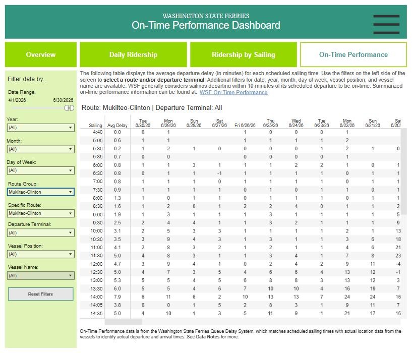
The On-Time Performance page, filtered to my route. Each cell is one sailing on one day: minutes late. The page also gives the rule: a sailing that leaves within 10 minutes of schedule counts as on time. To my surprise! Redefining a 10-minute delay as “on time” is the operational equivalent of rolling out of bed at 8:10 AM for an 8:00 AM meeting, showing up with coffee, and claiming you were early because you didn’t miss the entire morning. Yes, Yes, I know. Safety! Regulations! 1
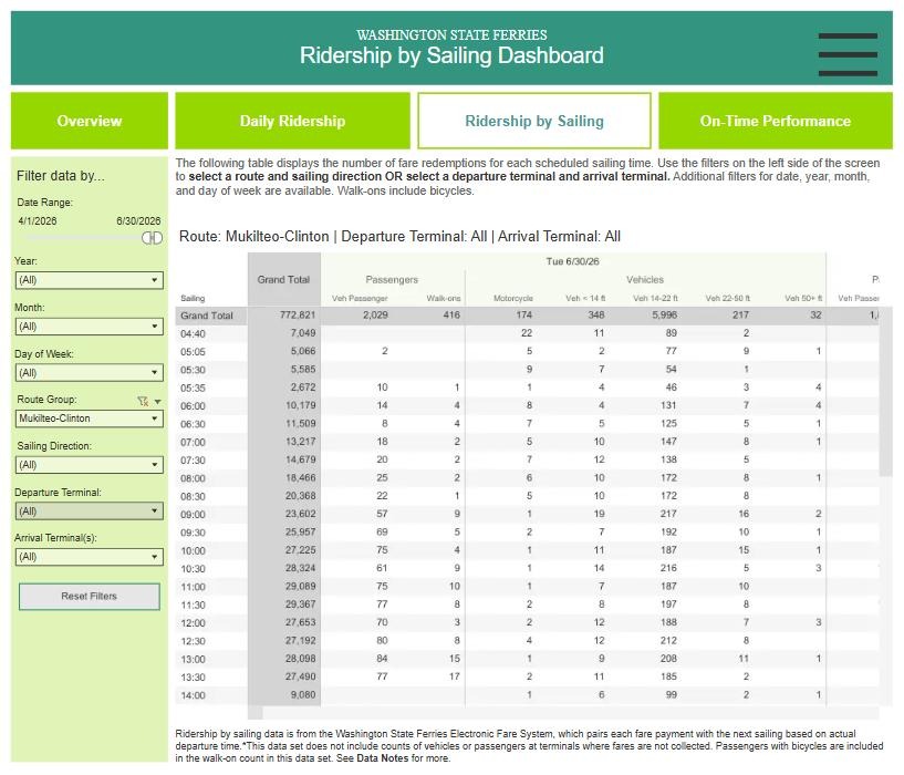
A second page counts the vehicles that paid at the toll booth before each sailing.
The Ridership by Sailing page: cars, trucks and walk-on riders counted at the toll booth for each sailing.2
These are sailing records, not answers from a survey of riders. The file contains about 168,000 sailings on this route, and about 162,000 of them have a usable departure delay. I give the number of sailings behind each main comparison. Because I am describing recorded trips rather than estimating from a random sample, a survey-style margin of error does not apply. Missing delays and the system’s measurement rules still matter.
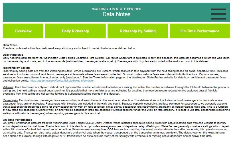
The dashboard’s data notes. Two lines matter most for this post: very late sailings often don’t match the schedule and show up as missing, and the toll-booth count is cars that paid, not cars that fit on the boat.3
What I did in R
I downloaded the two pages for my route, one file for each direction. A short script (prepare-data.R, in this post’s folder) turned them into one table with a row for every sailing.
My table in R: one row per sailing, with the day, the direction, the scheduled time, the boat, how many minutes late it left, and how many vehicles paid at the booth.
        date   weekday    direction time    vessel delay_min vehicles
1 2020-01-01 Wednesday From Clinton 0:30 Suquamish         0       NA
2 2020-01-01 Wednesday From Clinton 5:30 Suquamish         1       NA
3 2020-01-01 Wednesday From Clinton 6:30 Suquamish         2       NA
4 2020-01-01 Wednesday From Clinton 7:30 Suquamish         9       NA
5 2020-01-01 Wednesday From Clinton 8:00   Tokitae         1       NA
6 2020-01-01 Wednesday From Clinton 8:30 Suquamish         2       NA
Show the code
nrow(sailings)
[1] 168029
Minutes late is a number I can measure, so it’s a quantitative variable. To organize it, I sorted every summer 2025 sailing into four groups: on time, 11–19 minutes late, 20–29, and 30 or more. Counting how many land in each group gives a frequency distribution. Dividing each count by the total gives the relative frequency: the share in each group. The shares add up to 1, or 100%.
The frequency table for summer 2025: counts in each group, and the share of all sailings.
Show the code
s25 <-subset(summer, year ==2025)s25$how_late <-cut(s25$delay_min, breaks =c(-Inf, 10, 19, 29, Inf),labels =c("On time (10 min or less)", "11-19 min late","20-29 min late", "30+ min late"))counts <-table(s25$how_late)data.frame(group =names(counts),sailings =as.vector(counts), # frequencyshare =paste0(round(100*as.vector(prop.table(counts)), 1), "%")) # relative frequency
                     group sailings share
1 On time (10 min or less)     4960 77.3%
2           11-19 min late     1068 16.7%
3           20-29 min late      376  5.9%
4             30+ min late       10  0.2%
Of the 6,414 summer 2025 sailings with a recorded delay, 4,960 (77.3%) left within 10 minutes of schedule. About one in six left 11 to 19 minutes late. Ten left at least 30 minutes late. The ten-minute cutoff matters to my commute: a boat can count as on time and still leave me little room to catch the bus.
These records can’t tell me how often that happens. They track boats, not riders, so a missed bus never shows up in them. To learn that, I’d want a survey of people who commute by bus, then ferry, then bus again, on either side: how often a late boat costs them a connection, and how long they wait for the next one.
More summer sailings left late
Show the code
library(ggplot2)by_year <-aggregate(late ~ year, data =subset(summer, year <=2025), FUN = mean)ggplot(by_year, aes(x =factor(year), y = late)) +geom_col(fill ="#1a4f8b", width =0.7) +geom_text(aes(label =paste0(round(100* late), "%")), vjust =-0.4, size =3.8) +scale_y_continuous(labels =function(x) paste0(round(100* x), "%"), limits =c(0, 0.3)) +labs(x =NULL, y ="Sailings more than 10 minutes late",title ="Summer sailings that left late, Mukilteo–Clinton",subtitle ="June–August, both directions",caption ="Source: WSF Public Dashboard (preliminary), exported Sept. 26, 2026. About 5,800-6,600 sailings per summer.") +theme_minimal(base_size =12) +theme(plot.title.position ="plot")
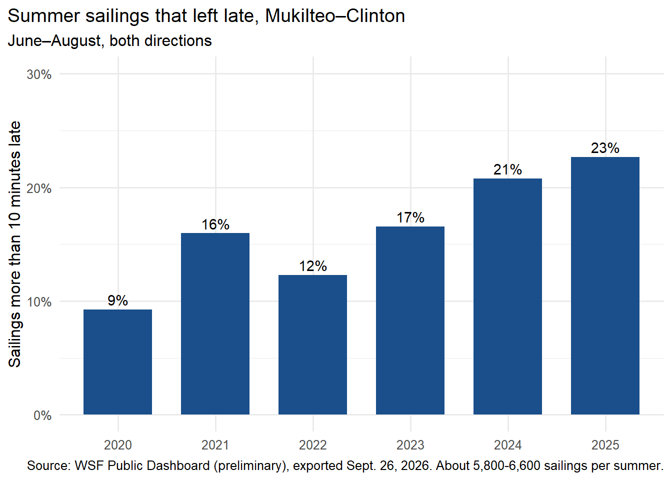
This is a bar graph: one bar for each summer. Each bar shows the share of summer sailings, at all times of day, that left more than 10 minutes late. That share rose from about 9% in 2020 to about 23% in 2025, with 5,807 to 6,567 sailings behind each bar. The dashboard export ends June 30, 2026, so this chart does not include the full summer of 2026.
Afternoon delays in both directions
Show the code
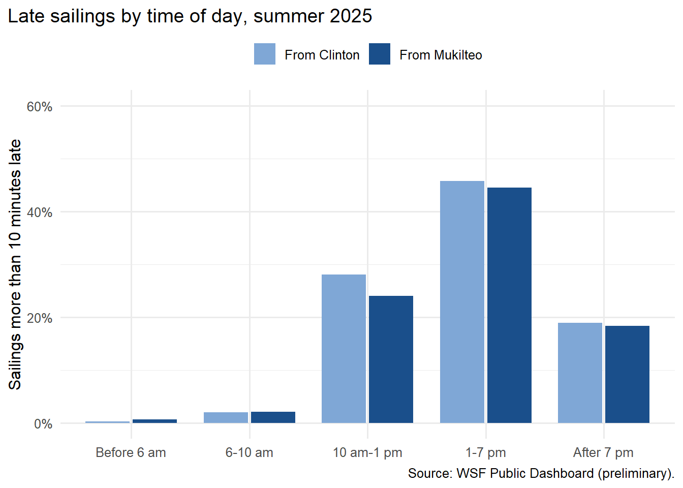
s25$part_of_day <-cut(s25$clock_min, breaks =c(0, 360, 600, 780, 1140, 1440), right =FALSE,labels =c("Before 6 am", "6-10 am", "10 am-1 pm", "1-7 pm", "After 7 pm"))by_part <-aggregate(late ~ part_of_day + direction, data = s25, FUN = mean)ggplot(by_part, aes(x = part_of_day, y = late, fill = direction)) +geom_col(position =position_dodge(width =0.8), width =0.75) +scale_fill_manual(values =c("From Mukilteo"="#1a4f8b", "From Clinton"="#7fa7d6"), name =NULL) +scale_y_continuous(labels =function(x) paste0(round(100* x), "%"), limits =c(0, 0.6)) +labs(x =NULL, y ="Sailings more than 10 minutes late",title ="Late sailings by time of day, summer 2025",caption ="Source: WSF Public Dashboard (preliminary).") +theme_minimal(base_size =12) +theme(plot.title.position ="plot", legend.position ="top")
Before 10 AM, few sailings left late (1.6% of 2,008). From 1 to 7 PM, close to half did, whether they left Mukilteo or Clinton (983 and 980 sailings). This is a side-by-side bar graph: the two bars for each time period put the directions side by side. I compare shares rather than counts because the time periods contain different numbers of sailings.
The August 2026 monthly report lists all 505 of the route’s late sailings as “accumulated delays,” which I read as delays carried over from earlier trips: the schedule had slipped and the boats had not caught up.4 That label does not show which boat or event started the delay.
So, is the big boat the late one?
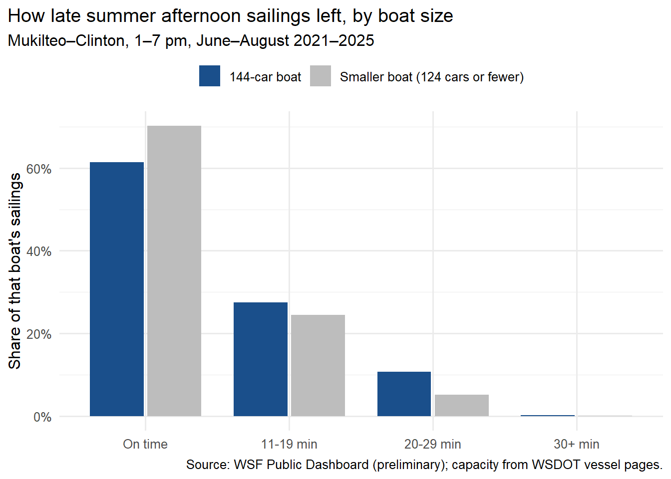
In the afternoons, the route runs a 144-car boat and, most summers, a 124-car boat.5 They take turns, so both run through the same busy hours. I compared them across five summers, 2021–2025, from 1 to 7 PM.
Show the code
aft <-subset(summer, year %in%2021:2025& clock_min >=780& clock_min <1140&!is.na(vehicle_capacity))aft$boat <-ifelse(aft$vehicle_capacity ==144, "144-car boat", "Smaller boat (124 cars or fewer)")aft$how_late <-cut(aft$delay_min, breaks =c(-Inf, 10, 19, 29, Inf),labels =c("On time", "11-19 min", "20-29 min", "30+ min"))shares <-as.data.frame(prop.table(table(aft$boat, aft$how_late), margin =1)) # share within each boat sizenames(shares) <-c("boat", "how_late", "share")ggplot(shares, aes(x = how_late, y = share, fill = boat)) +geom_col(position =position_dodge(width =0.8), width =0.75) +scale_fill_manual(values =c("144-car boat"="#1a4f8b", "Smaller boat (124 cars or fewer)"="#bdbdbd"), name =NULL) +scale_y_continuous(labels =function(x) paste0(round(100* x), "%")) +labs(x =NULL, y ="Share of that boat's sailings",title ="How late summer afternoon sailings left, by boat size",subtitle ="Mukilteo–Clinton, 1–7 pm, June–August 2021–2025",caption ="Source: WSF Public Dashboard (preliminary); capacity from WSDOT vessel pages.") +theme_minimal(base_size =12) +theme(plot.title.position ="plot", legend.position ="top")
Show the code
table(aft$boat)
                    144-car boat Smaller boat (124 cars or fewer)
                            6014                             4111
On summer afternoons from 2021 through 2025, the 144-car boats left more than 10 minutes late about 39% of the time (6,014 sailings). The smaller boats did so about 30% of the time (4,111 sailings). Their average departure delays were 8.7 and 6.9 minutes, respectively.
That supports the pattern I noticed, but it does not explain it. The two boat sizes may have run different mixes of years, hours, directions, or busy days. A delay from an earlier trip can also carry into the next one. In these records, the larger boats were late more often; I cannot tell from this comparison whether their size caused the difference. (Whether a gap like this could be chance is a later chapter: hypothesis tests.)
Here’s one thing I’ve watched from the deck that the records can’t show. Some afternoons the smaller boat slows or waits out in the water, partway across, because the big boat hasn’t cleared the dock yet. It looks to me like the small boat could be close to on time, but it gets held behind the big one. If that’s what’s happening, a big-boat delay turns into a small-boat delay too, which would fit every late sailing being logged as an “accumulated delay.” That’s my view from the rail, not something this data measures.
How far the minutes spread
Show the code
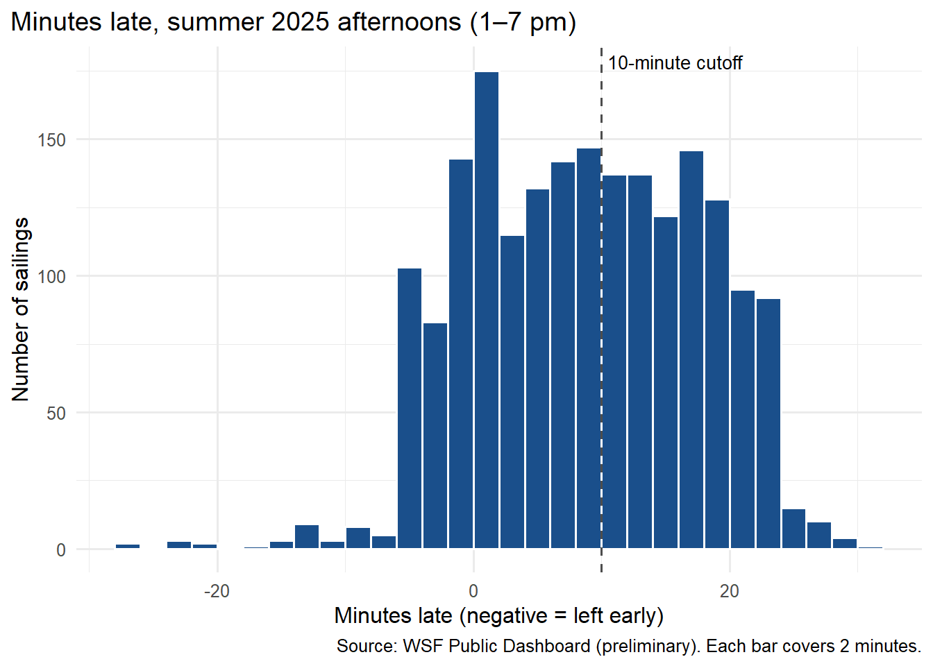
a25 <-subset(s25, part_of_day =="1-7 pm")ggplot(a25, aes(x = delay_min)) +geom_histogram(binwidth =2, boundary =0, fill ="#1a4f8b", colour ="white") +geom_vline(xintercept =10, linetype ="dashed", colour ="grey30") +annotate("text", x =10.5, y =Inf, label ="10-minute cutoff", hjust =0, vjust =1.5, size =3.6) +labs(x ="Minutes late (negative = left early)", y ="Number of sailings",title ="Minutes late, summer 2025 afternoons (1–7 pm)",caption ="Source: WSF Public Dashboard (preliminary). Each bar covers 2 minutes.") +theme_minimal(base_size =12) +theme(plot.title.position ="plot")
Show the code
summary(a25$delay_min)
   Min. 1st Qu.  Median    Mean 3rd Qu.    Max.
-28.000   2.000   9.000   9.167  16.500  32.000
A histogram is a bar graph for a measured number. Each bar covers a 2-minute range, and its height counts the sailings in that range. The middle half of afternoon sailings left 2 to 16 minutes late. The median was 9 minutes: half left earlier than that and half later. Many trips fell near WSF’s ten-minute cutoff, so even a small shift in departure time could change whether they count as late. This chart does not show what caused the yearly change.
What this data can’t see: the line
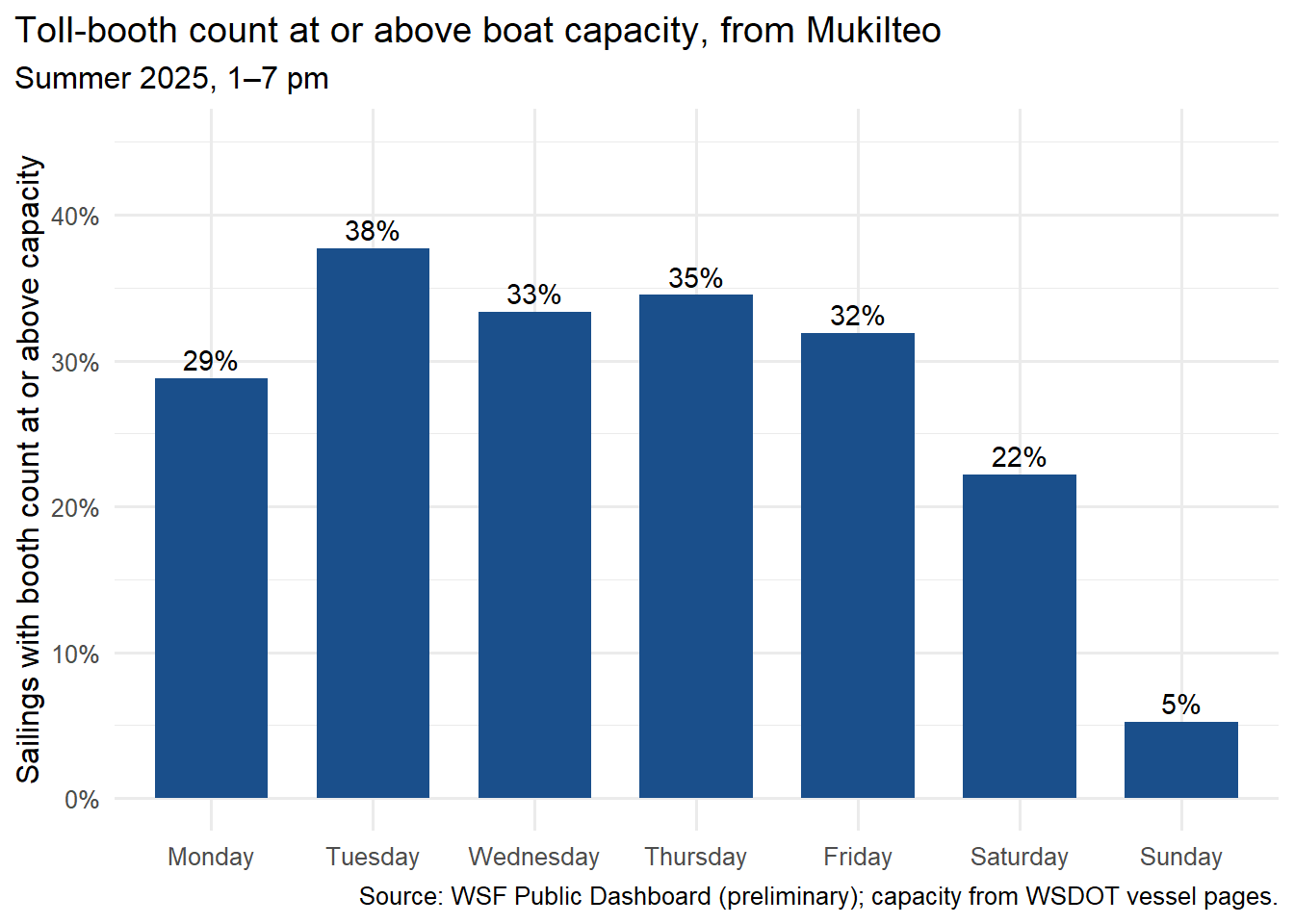
If late boats run 10 to 20 minutes behind, why can the car line on a summer afternoon feel like it takes hours? Because being late and being full are different problems. The toll-booth counts hint at the second one.
Show the code
v <-subset(sailings, year ==2025& month %in%6:8& direction =="From Mukilteo"& clock_min >=780& clock_min <1140&!is.na(vehicles) &!is.na(vehicle_capacity))v$over <- v$vehicles >= v$vehicle_capacitydays <-c("Monday", "Tuesday", "Wednesday", "Thursday", "Friday", "Saturday", "Sunday")by_day <-aggregate(over ~ weekday, data = v, FUN = mean)by_day$weekday <-factor(by_day$weekday, levels = days)ggplot(by_day, aes(x = weekday, y = over)) +geom_col(fill ="#1a4f8b", width =0.7) +geom_text(aes(label =paste0(round(100* over), "%")), vjust =-0.4, size =3.8) +scale_y_continuous(labels =function(x) paste0(round(100* x), "%"), limits =c(0, 0.45)) +labs(x =NULL, y ="Sailings with booth count at or above capacity",title ="Toll-booth count at or above boat capacity, from Mukilteo",subtitle ="Summer 2025, 1–7 pm",caption ="Source: WSF Public Dashboard (preliminary); capacity from WSDOT vessel pages.") +theme_minimal(base_size =12) +theme(plot.title.position ="plot")
On summer weekday afternoons, about a third of Mukilteo sailings (33% of 678) had a toll-booth count at least as large as the boat’s stated car capacity. That suggests heavy demand. It does not count cars left behind: the booth records vehicles that paid before a sailing, while trucks and RVs can take more space than ordinary cars. This chart cannot measure a two-hour wait.
Heavy demand is what my neighbors notice too. On Nextdoor, a local social site, I saw a woman argue that the route needs a third boat in summer because the line gets so long. The comments ran from support to sarcasm. People brought up state money and technical problems. I don’t know the full answer. As far as I know, Clinton has two docking slips and Mukilteo has one, and a third boat would have to fit into that. That’s a question I want to check against the ferry system’s own documents before I say more.
About 5% of summer 2025 sailings have no recorded delay. The dashboard notes say very late sailings are especially likely to lack a match to the schedule. My percentages describe sailings with a recorded delay. If the missing sailings were more likely to be late, the actual late share would be higher; these records cannot tell me by how much. It’s the same worry as nonresponse in a survey, showing up in a machine’s records.
The class words for what I found
Class term
In this post
Quantitative variable
Minutes late, cars at the booth: numbers I can measure or count
Qualitative variable
Direction, boat, “on time” or “late”: labels
Frequency
4,960 summer 2025 sailings left on time
Relative frequency
That’s 77.3% of the 6,414 summer 2025 sailings with a recorded delay
Bar graph
Late share by summer, 2020–2025
Side-by-side bar graph
Big boat vs. small boat, compared as shares within each group
Histogram
Minutes late in 2-minute bins
The Clinton ferry terminal from the water. Photo: Joe Mabel, CC BY-SA 3.0, via Wikimedia Commons.
What I will remember on my afternoon crossing
My dad drove this route to work in Ballard for about eight years. What he says he does not miss is the ferry line. The distinction matters: my charts show when boats leave late, but they cannot show how many cars are still waiting after a full boat pulls away.
For my own afternoon trip, I will still take the earlier boat when I find it at the dock. The records support the pattern I noticed about the larger boat, but they have not shown me what starts its delay. They also leave me with another question: after each sailing, how many cars remain in the lot, and does that number grow through the afternoon? That count would tell a story the toll-booth total cannot.
Washington State Ferries, WSF Public Dashboard (Tableau Public), data through June 30, 2026, labeled preliminary. Exported and screenshot Sept. 26, 2026.↩︎
Washington State Ferries, WSF Public Dashboard (Tableau Public), data through June 30, 2026, labeled preliminary. Exported and screenshot Sept. 26, 2026.↩︎
Washington State Ferries, WSF Public Dashboard (Tableau Public), data through June 30, 2026, labeled preliminary. Exported and screenshot Sept. 26, 2026.↩︎