A Washington State ferry crossing Elliott Bay on a June evening this summer, seen from Kerry Park in Seattle. Photo: Guywelch2000, June 27, 2026, CC BY 4.0, via Wikimedia Commons.
Class topic: MATH& 146, Section 2.4 — graphical misrepresentations of data.
On Monday, Oct. 5, 23 ferry engine-room workers called in sick, and 13 of the system’s 18 boats in service couldn’t sail. On my route, Mukilteo–Clinton, one boat ran and about half the sailings were canceled, KUOW reported. The dispute is over wages and overtime (Washington State Standard).
A week like this one brings out charts about the ferries. Someone will show one to say the system is falling apart. Someone else will show one to say it’s mostly fine. So I asked a smaller question first: using one set of honest numbers, how many different stories can I tell about my own route?
The answer surprised me. With ten summers of official records, I could make three true headlines. They don’t agree with each other.
Where the numbers come from
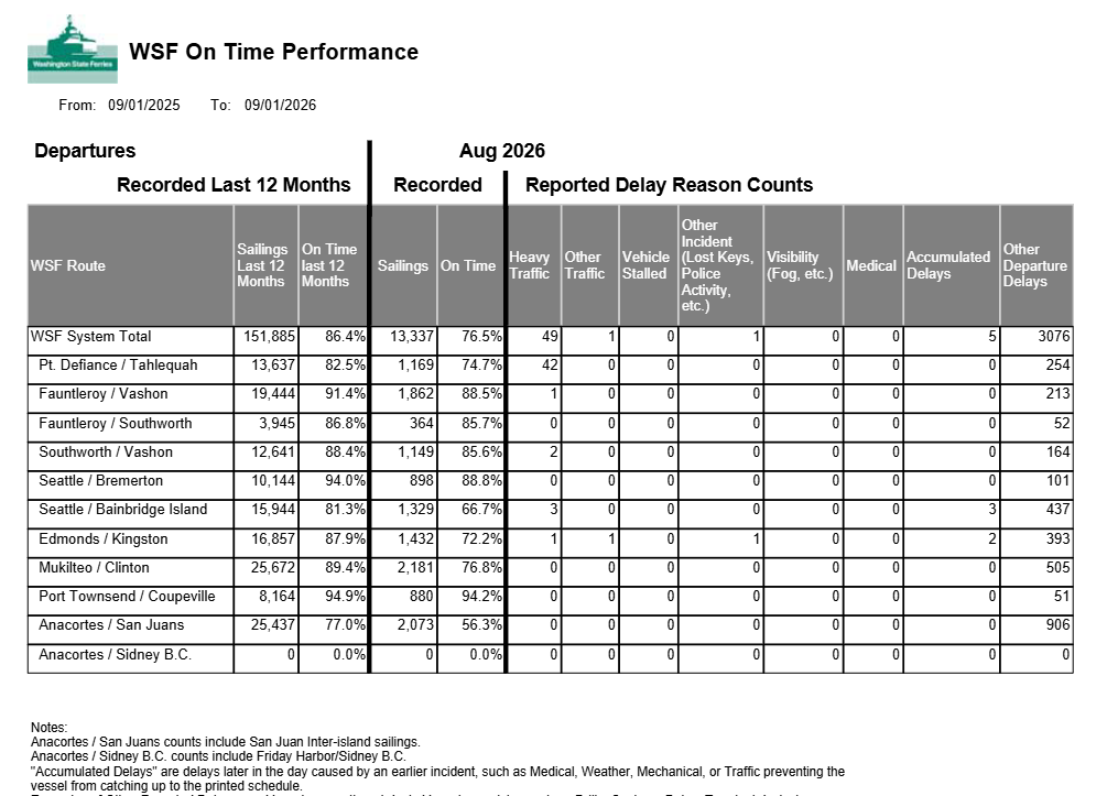
Washington State Ferries publishes a monthly On-Time Performance Report. For each route it lists how many sailings left that month and the share that left on time, which WSF defines as within 10 minutes of the schedule.
The August 2026 report. The Mukilteo / Clinton row: 2,181 sailings, 76.8% on time.1
I copied the June, July and August numbers for every summer from 2017 to 2026 into a small table: 30 rows, one per month, with the page of the report each number came from. These reports count every recorded departure, not a sample, so there’s no margin of error to report. The limits are in what gets counted, which I come back to below.
What I did in R
My table in R: one row per summer month, with the number of sailings and the share on time.
Show the code
otp <-read.csv("wsf-otp-summer_muk-clinton.csv")otp$late <- otp$departures * (1- otp$on_time_pct /100) # late sailings = sailings x share not on timehead(otp[, c("year", "month", "departures", "on_time_pct")])
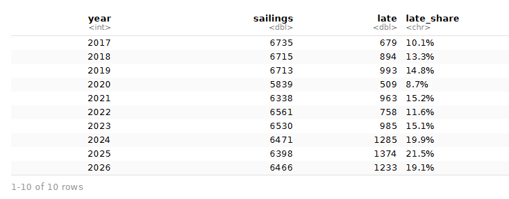
Each monthly report gives a share, not a count of late sailings. So for each month I multiplied the number of sailings by the share that was not on time. Then I added up June, July and August for each year and divided late sailings by all sailings. That gives one late share per summer. (Because the report rounds to one decimal, each monthly late count can be off by about one sailing.)
The summer table: sailings, late sailings, and the late share for each year.
library(ggplot2)pct <-function(x) paste0(x, "%")two <-subset(summers, year %in%c(2020, 2026))ggplot(two, aes(x =factor(year), y = late_pct)) +geom_col(fill ="#8c2d04", width =0.6) +coord_cartesian(ylim =c(8, 20)) +scale_y_continuous(labels = pct, breaks =seq(8, 20, 2)) +labs(x =NULL, y ="Summer sailings late",title ="\"Late ferries up 119% since 2020\"",subtitle ="MISLEADING: axis starts at 8%, and 2020 was the pandemic summer",caption ="Source: WSF On-Time Performance Reports, Mukilteo–Clinton, June–August.") +theme_minimal(base_size =12) +theme(plot.title.position ="plot")
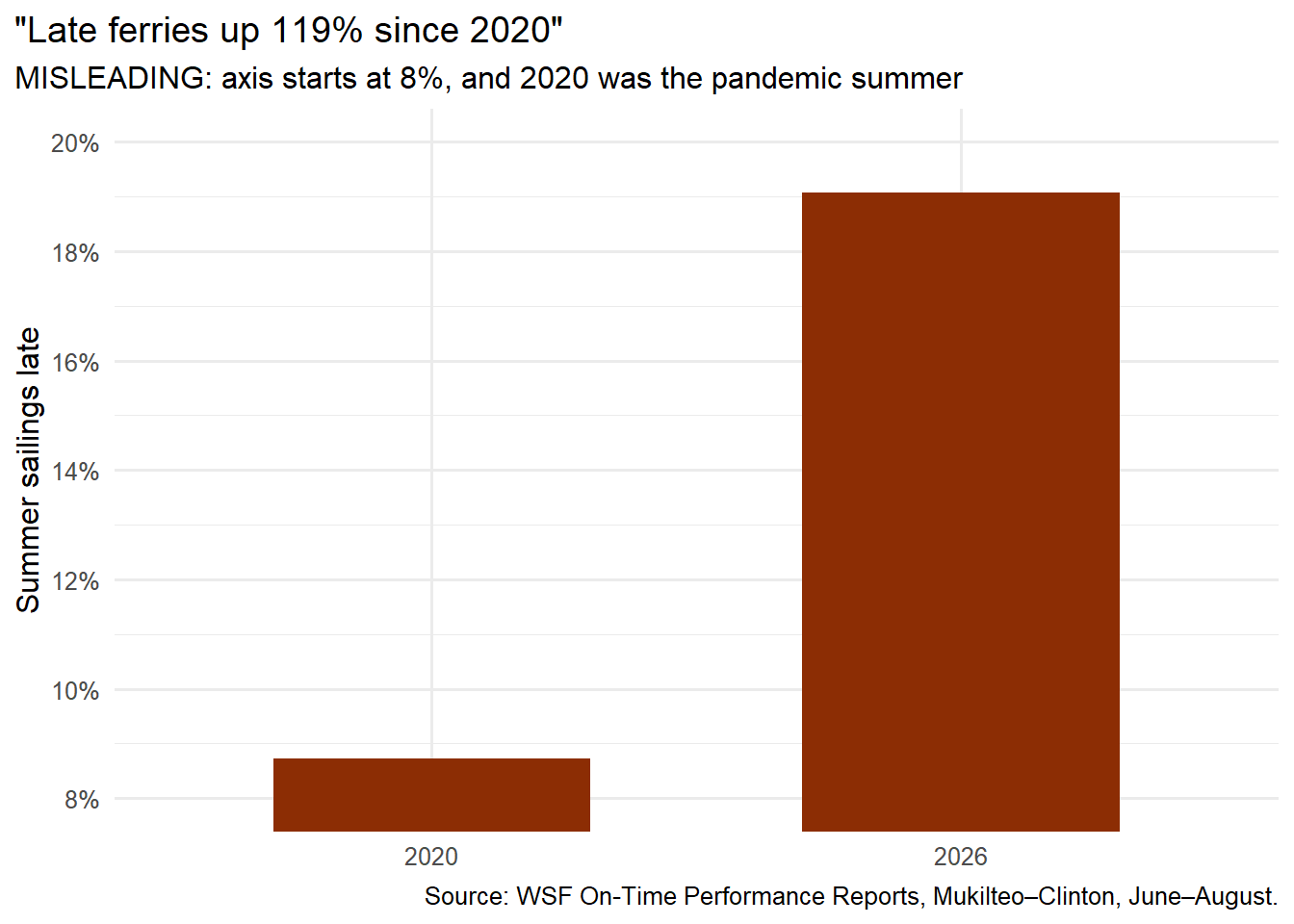
Every number on this chart is right. The late share went from 8.7% in summer 2020 to 19.1% in summer 2026. That’s 2.2 times as high, or up 119%.
It still misleads in two ways. First, the vertical axis starts at 8% instead of 0, so the 2026 bar looks about 15 times as tall when the real ratio is about two. Second, it picks its starting year. Summer 2020 was the first pandemic summer, and the route ran fewer sailings than in any other year here (5,839, compared with 6,338 to 6,735 in the others). It was also the best summer on the chart. Measuring “since 2020” starts the race from the best spot.
Headline 2: “Late ferries down 11% from last summer”
Show the code
two <-subset(summers, year %in%c(2025, 2026))ggplot(two, aes(x =factor(year), y = late_pct)) +geom_col(fill ="#1a4f8b", width =0.6) +coord_cartesian(ylim =c(18, 22)) +scale_y_continuous(labels = pct) +labs(x =NULL, y ="Summer sailings late",title ="\"Late ferries down 11% from last summer\"",subtitle ="MISLEADING: axis starts at 18%, and only two years are shown",caption ="Source: WSF On-Time Performance Reports, Mukilteo–Clinton, June–August.") +theme_minimal(base_size =12) +theme(plot.title.position ="plot")
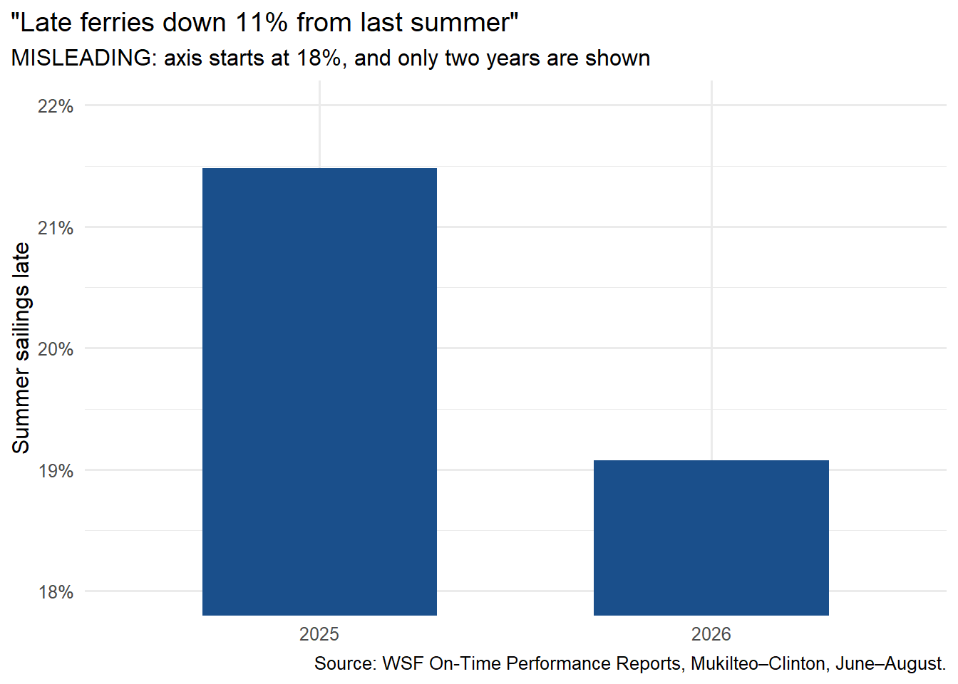
Also true. The late share fell from 21.5% in 2025 to 19.1% in 2026, a drop of 11% of its old value. On an axis that starts at 18%, the 2026 bar looks less than a third as tall as 2025’s. Showing only two years also hides that 2025 was the worst summer of the ten. Improving on your worst year is real, but it’s a low bar.
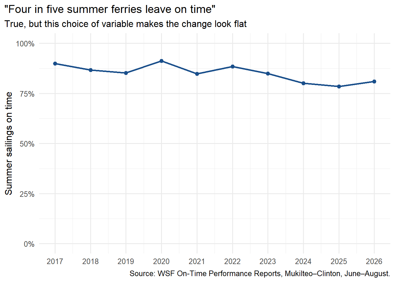
Headline 3: “Four in five summer ferries leave on time”
Show the code
ggplot(summers, aes(x = year, y = on_time_pct)) +geom_line(colour ="#1a4f8b", linewidth =1) +geom_point(colour ="#1a4f8b", size =2) +scale_y_continuous(labels = pct, limits =c(0, 100)) +scale_x_continuous(breaks =2017:2026) +labs(x =NULL, y ="Summer sailings on time",title ="\"Four in five summer ferries leave on time\"",subtitle ="True, but this choice of variable makes the change look flat",caption ="Source: WSF On-Time Performance Reports, Mukilteo–Clinton, June–August.") +theme_minimal(base_size =12) +theme(plot.title.position ="plot")
This chart has an honest axis that starts at 0. It’s still built to calm people down, because it shows the on-time share instead of the late share. In 2026, 80.9% of summer sailings left on time. On a 0-to-100 scale, the drop from about 90% to about 80% looks like a gentle slope.
Here’s the trick: going from 91% on time to 81% on time is the same change as going from 9% late to 19% late. Described one way, it’s an 11% drop. Described the other way, it’s a 119% jump. Which number you pick decides which story people hear.
The same change, three ways
Show the code
a <- summers[summers$year ==2020, ]; b <- summers[summers$year ==2026, ]data.frame(way_to_say_it =c("Change in percentage points","Percent change in the LATE share","Percent change in the ON-TIME share"),summer_2020_to_2026 =c(paste0("+", round(b$late_pct - a$late_pct, 1), " points late"),paste0("+", round(100* (b$late_pct / a$late_pct -1)), "%"),paste0(round(100* (b$on_time_pct / a$on_time_pct -1)), "%")))
                        way_to_say_it summer_2020_to_2026
1         Change in percentage points   +10.4 points late
2    Percent change in the LATE share               +119%
3 Percent change in the ON-TIME share                -11%
A percentage point is the plain difference between two percentages: 19.1% minus 8.7% is 10.4 points. A percent change divides that difference by the starting value. It gets big when the starting value is small, and small when the starting value is big. Both are correct. A headline will usually pick whichever one sounds more dramatic.
The honest chart
Show the code
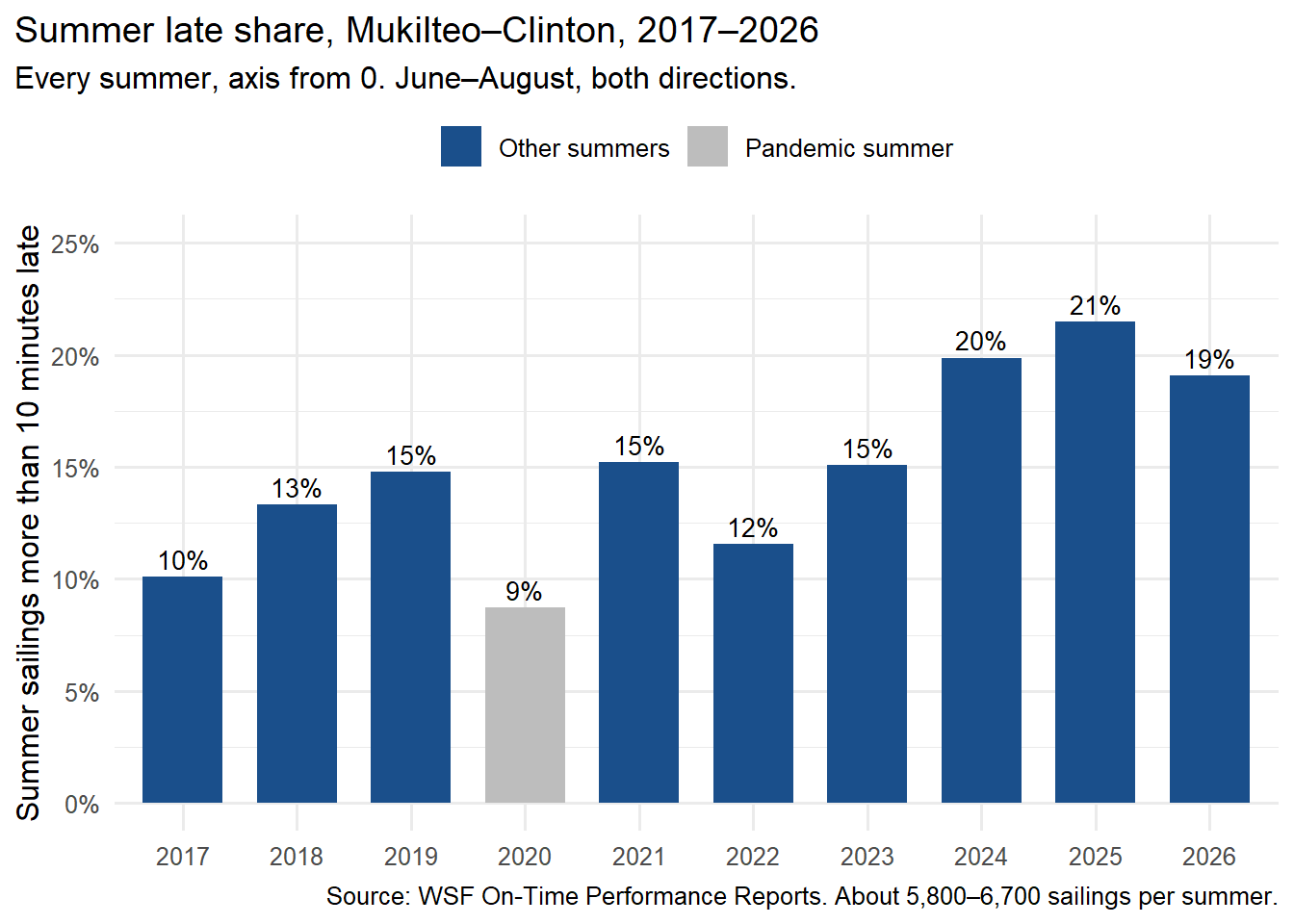
summers$label <-ifelse(summers$year ==2020, "Pandemic summer", "Other summers")ggplot(summers, aes(x =factor(year), y = late_pct, fill = label)) +geom_col(width =0.7) +geom_text(aes(label =paste0(round(late_pct), "%")), vjust =-0.4, size =3.6) +scale_fill_manual(values =c("Other summers"="#1a4f8b", "Pandemic summer"="#bdbdbd"), name =NULL) +scale_y_continuous(labels = pct, limits =c(0, 25)) +labs(x =NULL, y ="Summer sailings more than 10 minutes late",title ="Summer late share, Mukilteo–Clinton, 2017–2026",subtitle ="Every summer, axis from 0. June–August, both directions.",caption ="Source: WSF On-Time Performance Reports. About 5,800–6,700 sailings per summer.") +theme_minimal(base_size =12) +theme(plot.title.position ="plot", legend.position ="top")
Here’s every summer on one scale, starting at zero. From 2017 to 2023, about 10% to 15% of summer sailings left late each year, apart from the low pandemic summer. The last three summers, 2024 to 2026, were the three worst, at about 19% to 21%. This summer was a bit better than last summer, but still one of the worst three of the ten.
That’s the sentence I’d stand behind: the summer late share is up from its old range, and this summer was a small improvement on the worst one. It isn’t as catchy as either headline.
What none of these charts count
These reports measure sailings that left. As far as I can tell from the reports, a canceled sailing never leaves, so it can’t be counted as late. On a day like Oct. 5, half the Clinton sailings could be canceled while the ones that ran still left on time. That day could show up as a good on-time day.
So “on time” and “sailed at all” are two different measures, and a chart of one can hide the other. The “about 98% of summer sailings ran” figure a ferry system leader gave in September (my last ferry post) is the second kind. I haven’t checked WSF’s own numbers for it yet. The October report, due out in about a month, should show whether the sick-out moved the on-time number at all.
The class words for what I found
Class term
In this post
Misleading graph
A chart that leads readers to a conclusion the numbers don’t support
Truncated axis
Headlines 1 and 2: axes starting at 8% and 18% make small gaps look large
Cherry-picked time frame
Starting at the pandemic summer, or showing only two years
Choice of variable
Late share vs. on-time share: the same change looks big or small
Percentage points vs. percent change
+10.4 points = +119% for the late share = −11% for the on-time share
Riders waiting at the new Mukilteo terminal. Photo: SounderBruce, CC BY-SA 4.0, via Wikimedia Commons.
What I’ll remember next time I see a ferry chart
I first heard about the sick-out at 7 that morning, from my boss’s husband. He said they were only running one boat and the wait for the next ferry was an hour and a half. I didn’t think much of it. Some days the ferries are just like that: a boat down, work on a dock, a weird day.
Then my boss came in. Her wait had been two hours. A coworker joined the conversation and filled in the rest. This wasn’t slow loading or a schedule out of whack. It was a labor action: workers calling in sick together. As I understand it, ferry workers aren’t allowed to strike, so this is the closest thing to one.
It made me think of the Nextdoor post from my last ferry piece, the one asking for a third boat in the summer. You can’t run a third boat if you can’t crew the first two. Delays aren’t only about how big the boat is or how fast it loads. Some causes are inside the ferry system, like crews and maintenance. Some come from outside it, like traffic. None of the charts here can tell those apart.
As for the headlines, the first one feels truest to me, even though it’s the most misleading. People notice the bad stuff. Walk into a bathroom and you see the one dirty corner, not the clean sink. I can’t relate to the second one at all. I don’t remember last summer well enough to compare it to this one, and I doubt most riders do. That’s what the ten years of data are for. The third one reads like spin to me. It may be true, but if you’re running a ferry system, you should be looking for what to fix.
The honest chart is the one I’d hand someone. It starts at zero, the bars are comparable, and it runs from before COVID to now. But the biggest lesson for me is what isn’t on it: canceled sailings. What a chart leaves out can matter as much as what it shows.
Here’s what I’ll check from now on, before I believe a chart:
Does the y-axis start at zero?
Does the x-axis move in even steps, with the same size time blocks?
Are the categories the same size?
Was every group measured the same way?
Do the jumps look fair for the numbers behind them?
What isn’t being counted?
Sources:WSF On-Time Performance Reports, annual reports 2017–2025 and monthly reports June–August 2026 (page numbers in wsf-otp-summer_muk-clinton.csv), read Oct. 5, 2026 · KUOW, Oct. 5, 2026 · Washington State Standard, Oct. 5, 2026. Photos: Wikimedia Commons (CC BY 4.0 and CC BY-SA 4.0), credited above. Data file:wsf-otp-summer_muk-clinton.csv, transcribed from the WSF PDFs.